In short
Bootstrap gives you ready-made buttons, navbars, modals and a grid system. It's still common in college projects, admin panels and older company codebases.
A long-standing CSS framework with a prebuilt grid system, components (navbars, modals, cards) and utility classes for rapid, consistent UI building. Bootstrap is useful when speed and consistency matter, while understanding its grid, utilities, component APIs, and customization model helps prevent fighting the framework.

Think of it like this
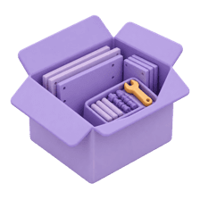
Furniture from a big furniture store
Flat-pack furniture gets your room set up quickly and it looks decent, but your room looks like many others. Bootstrap is that: fast, reliable components, at the cost of a design everyone recognises unless you customise it.
Watch it happen
Same cards, three breakpoints
1/4Below md, col-12 applies. Each card takes all 12 columns, so one card per row.
The big ideas
What you need to know
Ready components
Buttons, cards, navbars, modals, alerts and forms come pre-styled. Add the classes and you're done.
12-column grid
.row and .col-md-4 split the width into 12 parts, with breakpoints like sm, md, lg and xl.
JS for interactive parts
Dropdowns, modals and collapses need Bootstrap's JavaScript bundle. Since version 5 it doesn't need jQuery.
Customise with variables
Change the theme by overriding its Sass or CSS variables, so your site doesn't look like default Bootstrap.
See it in code
Walk through the code
1<div class="container py-4">2 <div class="row g-4">3 <div class="col-12 col-md-6 col-lg-4">4 <div class="card h-100">5 <div class="card-body">6 <h5 class="card-title">Placement Prep</h5>7 <p class="card-text">Aptitude, DSA and mock interviews.</p>8 <a href="#" class="btn btn-primary">Start</a>9 </div>10 </div>11 </div>12 <!-- repeat .col for more cards -->13 </div>14</div>1/3container sets the page width. row starts a grid row, g-4 sets the gutter.
col-12 is full width on phones, col-md-6 is half from md, col-lg-4 is a third from lg. g-4 sets the gap between columns.
Save yourself the pain
Common mistakes
Oops
Shipping a project that looks exactly like the Bootstrap docs.
Do this instead
Change at least the colours, fonts and border radius through its variables.
Oops
Fighting Bootstrap styles with !important everywhere.
Do this instead
Override its variables, or switch to plain CSS or Tailwind if you're overriding more than you use.
Your mission
Admin panel in an hour
Quick check
In Bootstrap's grid, how many cards fit in one row on large screens if each has col-lg-3?
Go deeper
- 1Build a simple landing page using Bootstrap's grid and components. Keep the first version small, then add one improvement after the core behavior works.
- 2Compare Bootstrap's component-based approach with Tailwind's utility-first approach. Write down when you would choose each option and what trade-off drives that choice.
- 3Learn how to customize Bootstrap's default theme variables.
More styling tools & libraries at this stop
 Tailwind CSS
 SCSS/SASS
 Styled Components
 CSS Modules

Stuck on this topic? Ask an Insider
Get 1:1 guidance from people who've walked this exact path — on the InsideEdge app.
