Component Composition
Part of the Full Stack Developer Roadmap
In short
Instead of building a giant component with twenty settings, React lets you nest components inside each other. One Card or Modal can wrap anything, which is how real design systems stay small.
Building complex UIs by combining small, focused components together (often via `children`) rather than building large, monolithic ones — the idiomatic React way to achieve reuse.

Think of it like this
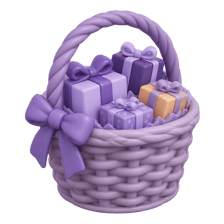
The Diwali gift hamper
The shop has one kind of wicker basket. One customer fills it with dry fruits, another with sweets and a candle. The basket doesn't care what goes in, it just holds it nicely. A Card with children is that basket.
Watch it happen
Same Card, different children
1/4AccountPage doesn't draw borders or padding itself. It only arranges pieces.
The big ideas
What you need to know
children is a prop
Whatever you put between <Card> and </Card> arrives as props.children, ready to place anywhere.
Slots beat flags
Instead of showFooter, footerText, footerLink props, accept a footer prop that takes any JSX.
Layout components
PageLayout, Sidebar and Modal are classic wrappers. They handle structure while pages supply the content.
Avoids prop drilling
Composing at the top lets you pass data straight to the component that needs it, not through five layers.
See it in code
Walk through the code
1function Card({ title, children, footer }) {2 return <section className="card">3 <h2>{title}</h2>4 <div className="card-body">{children}</div>5 {footer && <footer>{footer}</footer>}6 </section>;7}8 9export default function AccountPage({ user, orders }) {10 return (11 <>12 <Card title="Profile"><ProfileForm user={user} /></Card>13 <Card title="Recent orders" footer={<a href="/orders">See all</a>}><OrderTable rows={orders} /></Card>14 </>15 );16}1/3Card draws the frame and places children in the body. footer is an optional slot.
Card knows nothing about profiles or orders. That's exactly why it's reusable.
Save yourself the pain
Common mistakes
Oops
Adding a new boolean prop every time a page needs the Card to look slightly different.
Do this instead
Accept children and slot props like footer or actions, so callers pass the JSX they need.
Oops
Passing user through Page, Layout, Sidebar and Menu just to reach Avatar.
Do this instead
Compose higher up: render <Avatar user={user} /> at the top and pass it into Layout as a prop.
Your mission
Build a reusable Modal
Quick check
Where does the content between <Card> and </Card> show up inside the Card component?
Go deeper
- 1Refactor one large component into several smaller, composed components.
- 2Build a reusable layout component that wraps page content via `children`.
- 3Learn the 'compound components' pattern for related components that work together, e.g. a Tabs component.
More topics at this stop
 Components & JSX
 Props & State
 Hooks
 Context API
 React Router
 Forms in React
 Custom Hooks

Stuck on this topic? Ask an Insider
Get 1:1 guidance from people who've walked this exact path — on the InsideEdge app.
