
Design Consistency
Part of the UI/UX Design Roadmap
In short
When a button looks and works the same everywhere, users stop thinking about your app and just use it. Consistency is what makes a product feel easy without anyone noticing why.
Using the same patterns, components and terminology for the same kind of action or content throughout a product — consistency reduces cognitive load by letting users apply what they've already learned.
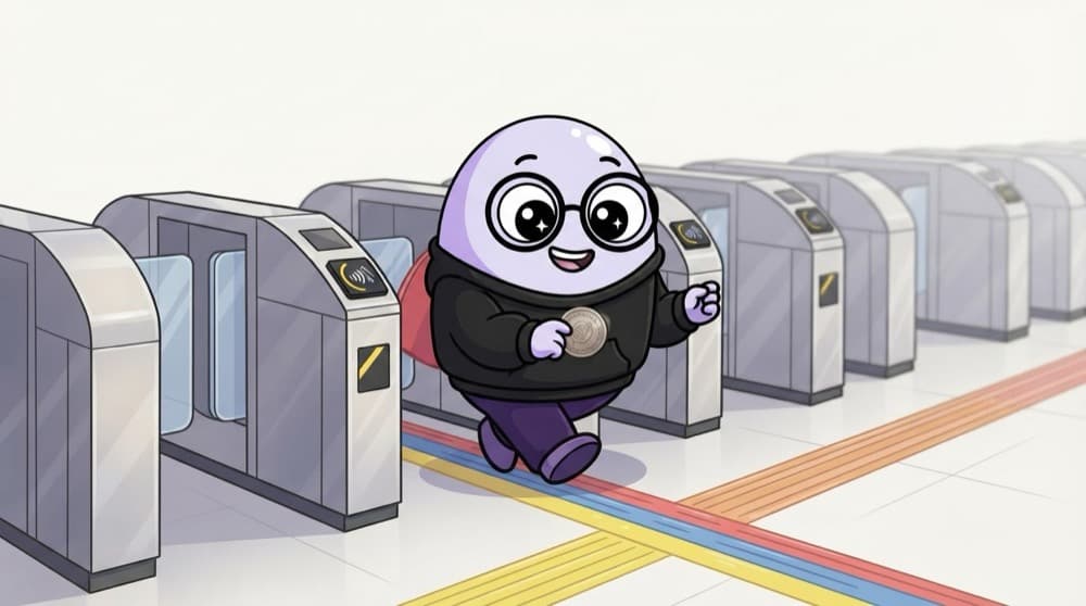
Think of it like this
Metro stations
Every Delhi Metro station follows the same pattern: tap in at the gate, follow the coloured line, find the platform. Once you've used one station, you can use them all. That's what consistency gives your users.
Watch it happen
The same action across four screens
1/4Before: each screen's main button has a different colour, size and position. Users hunt for it every time.
The big ideas
What you need to know
Same job, same look
Buttons, links, inputs and cards should look the same wherever they do the same job.
Words count too
Use the same word for the same thing. 'Orders' on one screen and 'Purchases' on another confuses people.
Follow the platform
iPhone and Android users expect their platform's patterns, like back gestures. Fight them only for a strong reason.
Components keep it consistent
Building screens from reusable components means a fix in one place updates everywhere.
Save yourself the pain
Common mistakes
Oops
Redesigning each screen from scratch to make it feel fresh.
Do this instead
Reuse your existing components. Fresh ideas belong in the problem solving, not in random new button styles.
Oops
Being so consistent you copy a pattern that doesn't fit.
Do this instead
Consistency is a default, not a cage. Break it when the user's task truly needs it, and do it on purpose.
Your mission
Hunt for inconsistencies
Quick check
Why does consistency make an app feel easier to use?
Go deeper
- 1Audit an app for inconsistent button styles or terminology across different screens.
- 2Learn why consistency (even a 'good enough' consistent pattern) usually beats a locally 'better' but inconsistent one.
- 3Preview Phase 8 (Design Systems) as the structural solution to consistency at scale.
More topics at this stop
 Gestalt Principles
 Color Theory
 Typography Fundamentals
 Layout & Grid Systems
 Visual Hierarchy
 Contrast & Whitespace
 Iconography Basics
 Accessibility Basics (WCAG)
 Dark Mode & Theming
 Design Trends vs Timeless Principles

Stuck on this topic? Ask an Insider
Get 1:1 guidance from people who've walked this exact path — on the InsideEdge app.
