In short
Why are 'Pay' buttons big and at the bottom of the screen? Fitts's Law: the bigger and closer a target is, the faster and more accurately you can hit it.
The time to reach a target depends on its size and distance — bigger, closer targets are faster and easier to hit, which is why frequently-used buttons should be large and conveniently placed.
Think of it like this
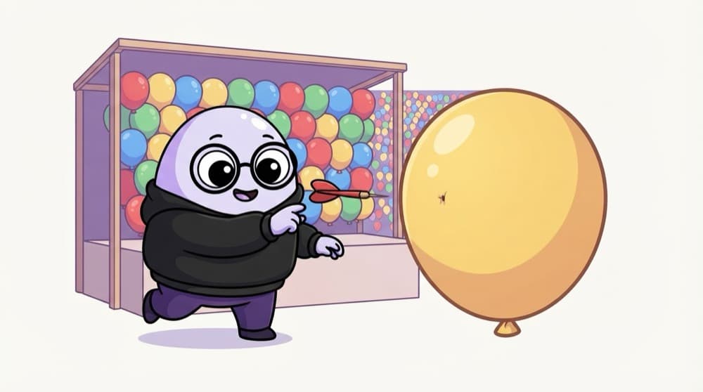
Throwing darts at the mela
At the mela dart stall, a big balloon right in front of you is easy money. A tiny one at the back wall needs luck. Buttons work the same: big and close gets hit quickly, small and far gets missed.
Watch it happen
A small far button vs a big near one
Small and far
- Tiny icon in the top corner
- Thumb has to stretch across
- Slow, and easy to mis-tap
Big and near
- Full-width button at the bottom
- Right under the thumb
- Quick and hard to miss
Make your most used actions large and place them where hands already are. Keep rare or risky actions smaller and further away.
The big ideas
What you need to know
Size matters
A bigger target is faster to hit. Pad small icons with extra tappable space around them.
Distance matters
Put the next action near where the user's finger or cursor already is.
Edges are easy on desktop
A mouse stops at screen edges, so menus at the edge are easy to hit. On phones, edges are harder for thumbs.
Use it in reverse
Make 'Delete account' smaller and away from 'Save' so nobody hits it by accident.
See it in code
Walk through the code
1T = a + b × log2(D / W + 1)2 3T = time to hit the target4D = distance to the target5W = width (size) of the target1/2Time grows with the log of distance divided by width. a and b are constants measured for a device.
The Shannon form of Fitts's Law. You don't need to calculate it, just remember: more distance or a smaller target means more time.
Save yourself the pain
Common mistakes
Oops
Putting 'Cancel' and 'Delete' as two equal buttons right next to each other.
Do this instead
Separate them and style the destructive one differently, so a slip doesn't destroy data.
Oops
Making the tappable area exactly the size of a small icon.
Do this instead
Keep the icon small if you like, but give it a larger invisible hit area.
Your mission
Thumb map your favourite app
Quick check
Which change makes a 'Checkout' button easier to hit, according to Fitts's Law?
Go deeper
- 1Identify a frequently-used but too-small tap target in an app you use.
- 2Apply Fitts's Law to justify the size and placement of a primary call-to-action button.
- 3Learn why this law is especially important for mobile touch targets and accessibility.
More topics at this stop
 Nielsen's 10 Usability Heuristics
 Cognitive Load & Hick's Law
 Usability Testing Methods
 Heuristic Evaluation Process
 A/B Testing for Design
 Accessibility Testing
 Design Critique Skills

Stuck on this topic? Ask an Insider
Get 1:1 guidance from people who've walked this exact path — on the InsideEdge app.
