In short
Headless UI is made by the Tailwind CSS team. It gives you menus, dialogs and listboxes that behave correctly, and you style every pixel with Tailwind classes.
Tailwind Labs' set of unstyled, accessible UI primitives (menus, modals, listboxes) designed to pair naturally with Tailwind CSS.
Think of it like this
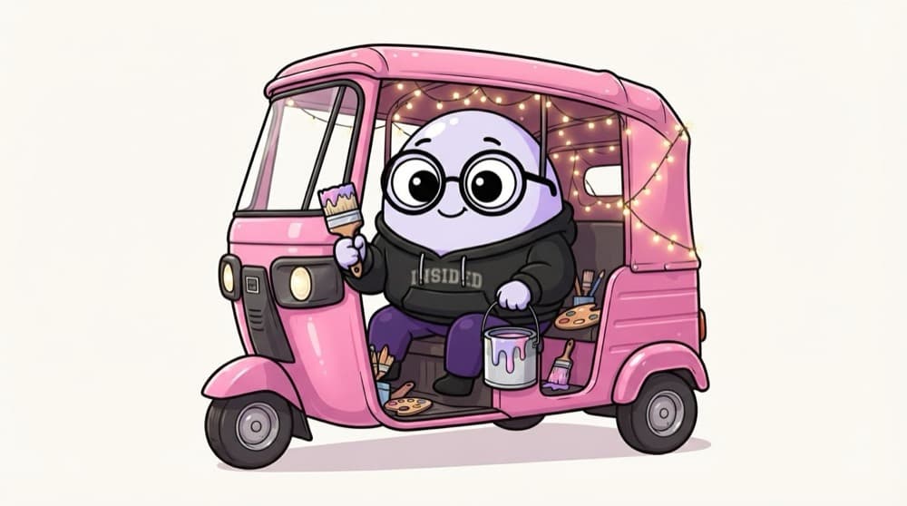
An auto with the engine fitted
The auto-rickshaw comes with a working engine, brakes and meter. Paint it pink, add LED lights, write a shayari on the back, it's your call. Headless UI fits the engine. Tailwind is your paint.
Watch it happen
Headless UI or Radix UI?
Headless UI
- Made by the Tailwind CSS team
- Fewer components, simple API
- States as data attributes for Tailwind
Radix UI
- Larger set of primitives
- Works with any styling approach
- Many small composable parts per component
Already on Tailwind and need menus, dialogs and listboxes? Headless UI. Need more primitives or no Tailwind? Radix.
The big ideas
What you need to know
Headless means no styles
The library manages open state, focus and keyboard support. It renders no visual design of its own.
Made for Tailwind
Components expose states as data attributes, so Tailwind classes like data-focus:bg-gray-100 style them directly.
Built-in positioning
In v2, the anchor prop places menus and popovers next to their button and keeps them on screen.
See it in code
Walk through the code
1import { Menu, MenuButton, MenuItems, MenuItem } from "@headlessui/react";2export function ProfileMenu() {3 return (4 <Menu>5 <MenuButton className="rounded-md bg-violet-600 px-3 py-2 text-white">Account</MenuButton>6 <MenuItems anchor="bottom end" className="w-44 rounded-md bg-white p-1 shadow-lg">7 <MenuItem>8 <a href="/profile" className="block rounded px-3 py-2 data-focus:bg-violet-100">Profile</a>9 </MenuItem>10 <MenuItem>11 <button className="block w-full rounded px-3 py-2 text-left data-focus:bg-violet-100">Log out</button>12 </MenuItem>13 </MenuItems>14 </Menu>15 );16}1/3Menu holds the state and MenuButton toggles it open and closed.
data-focus is set on the item under the mouse or arrow keys. With Tailwind v3, write data-[focus]:bg-violet-100 instead.
Save yourself the pain
Common mistakes
Oops
Copying v1 code with render props like {({ active }) => ...}.
Do this instead
v2 uses data attributes such as data-focus and named exports like MenuButton. Check your version first.
Oops
Using Headless UI without Tailwind and then writing tons of CSS.
Do this instead
If you don't use Tailwind, Radix or React Aria may suit you better.
Your mission
Navbar with a real dropdown
Quick check
In Headless UI v2, how do you style the menu item the user is currently on?
Go deeper
- 1Build a modal or dropdown using Headless UI with Tailwind for styling.
- 2Compare Headless UI to Radix UI — similar philosophy, different component sets.
- 3Notice how 'headless' components separate behavior/accessibility from visual styling.
More topics at this stop
 Material UI
 Shadcn UI
 Chakra UI
 Ant Design
 Mantine
 Radix UI

Stuck on this topic? Ask an Insider
Get 1:1 guidance from people who've walked this exact path — on the InsideEdge app.
