
In short
Logos, icons and simple illustrations that stay razor sharp on any screen, at a few KB. That's SVG, and you can style it with CSS like any other HTML.
Scalable Vector Graphics — an XML-based format for resolution-independent icons, illustrations and data visualizations that stay crisp at any zoom level. Because SVG is vector-based, it is particularly useful for icons, logos, diagrams, and illustrations that must remain sharp at different sizes and resolutions.
Think of it like this
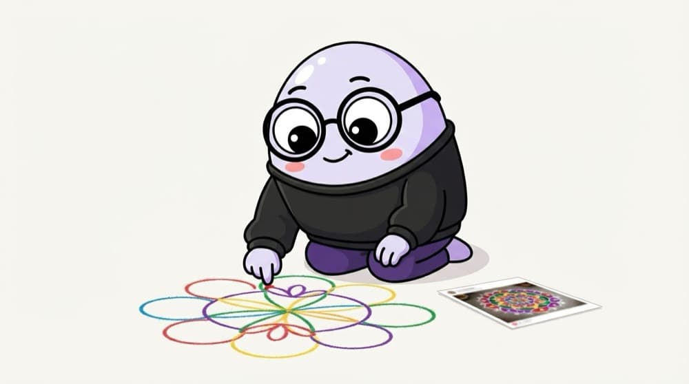
Rangoli instructions vs a photo of rangoli
A photo of a rangoli gets blurry if you blow it up. Instructions like 'draw a circle here, a petal there' work at any size. PNG is the photo. SVG is the instructions, so it never pixelates.
Watch it happen
SVG or PNG?
SVG
- Shapes stored as maths
- Sharp at any size
- Colour with CSS
PNG
- Stored as fixed pixels
- Blurs when scaled up
- Best for photos and screenshots
Icons, logos and simple illustrations: SVG. Photos: JPG, WebP or AVIF.
The big ideas
What you need to know
Shapes, not pixels
SVG describes circles, lines and paths with maths, so it scales to any size without losing quality.
viewBox is the canvas
viewBox="0 0 24 24" sets the drawing's own coordinate grid. width and height just decide how big it shows.
Style it with CSS
Inline SVG can use fill="currentColor", so the icon takes the text colour around it, hover effects included.
Not for photos
Photos have millions of colours. Use JPG, WebP or AVIF for them and keep SVG for flat graphics.
See it in code
Walk through the code
1<button class="like">2 <svg viewBox="0 0 24 24" width="20" height="20" aria-hidden="true">3 <path fill="currentColor"4 d="M12 21s-7-4.4-9.5-9A5.5 5.5 0 0 1 12 6a5.5 5.5 0 0 1 9.5 6C19 16.6 12 21 12 21z" />5 </svg>6 Like7</button>8 9<style>10 .like { color: #555; }11 .like:hover { color: crimson; }12</style>1/3viewBox sets a 24 by 24 drawing grid. width and height decide how big it shows.
The heart uses currentColor, so it turns red with the text on hover. aria-hidden hides it from screen readers since the word 'Like' already explains it.
Save yourself the pain
Common mistakes
Oops
Exporting icons as PNGs at 2x and 3x sizes.
Do this instead
Use one SVG. It looks sharp on every screen and is usually smaller.
Oops
Pasting SVGs straight from Figma with fixed fill colours.
Do this instead
Change the fill to currentColor so CSS can control the colour.
Your mission
Hand-draw an icon
Quick check
You make an SVG icon 10 times bigger with CSS. What happens to its quality?
Go deeper
- 1Inline an SVG icon directly in HTML and style it with CSS `fill`. Validate your understanding by applying it in a small practical example.
- 2Try animating an SVG path with CSS or a small script. Inspect the result in DevTools or the console and explain what you observed.
- 3Compare SVG vs PNG/JPG — when each is the right choice.
More topics at this stop
 Semantic tags
 Forms
 Input types
 Validation
 Tables
 Accessibility (ARIA)
 Audio
 Video
 Canvas
 SEO basics
 Meta tags

Stuck on this topic? Ask an Insider
Get 1:1 guidance from people who've walked this exact path — on the InsideEdge app.
