
Localization Basics
Part of the UI/UX Design Roadmap
In short
Translate your app and 'Save' might double in length, or the whole layout might flip right to left. In a country with as many languages as India, plan for that from day one.
Designing interfaces that can adapt to different languages — text expansion/contraction, right-to-left layouts, and avoiding text baked into images — essential for any product with an international audience.
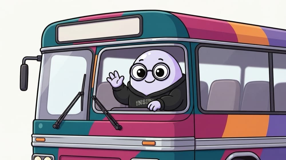
Think of it like this
Bus boards in many states
A bus from Bengaluru to Chennai shows its destination in Kannada, Tamil and English. The board must have room for all of them, and each script needs a different amount of space. Your buttons and labels need the same breathing room.
Watch it happen
The same word in different languages
1/4English 'Save' is four letters. You might design a tight button around it.
The big ideas
What you need to know
Leave room to grow
Text often gets longer when translated. Use auto layout so buttons and labels can expand or wrap.
No text in images
Text baked into images can't be translated easily. Keep text as real text.
Plan for right to left
Languages like Arabic and Urdu read right to left. Layouts and directional icons mirror.
Formats change too
Dates, numbers and currency are written differently. 1,00,000 in India is 100,000 in many other places.
See it in code
A tiny example
1{2 "cart.count": "{count, plural, =0 {Your cart is empty} one {# item in your cart} other {# items in your cart}}",3 "cart.checkout": "Checkout"4}An ICU plural message. Translators can write the right plural forms for their language instead of developers gluing words together in code.
Save yourself the pain
Common mistakes
Oops
Building sentences by joining pieces, like 'You have' + count + 'items'.
Do this instead
Use full messages with placeholders. Word order and plurals change across languages.
Oops
Designing buttons with fixed widths that just fit the English word.
Do this instead
Let components grow with content, and test with a longer language before handoff.
Your mission
Translate your layout
Quick check
Why should you avoid putting text inside images?
Go deeper
- 1Check how a piece of English UI copy would expand in a language like German (often 30%+ longer).
- 2Learn why hardcoding text length assumptions into a fixed-width button breaks in other languages.
- 3Research the basics of right-to-left (RTL) layout considerations for languages like Arabic.
More topics at this stop
 UX Writing Fundamentals
 Microcopy & Button Labels
 Error Message Writing
 Tone & Voice in Product Copy
 Content-First Design
 Writing for Accessibility

Stuck on this topic? Ask an Insider
Get 1:1 guidance from people who've walked this exact path — on the InsideEdge app.
