Website Redesign Case Study
Part of the UI/UX Design Roadmap
In short
Redesigning a real, flawed website proves you can find concrete problems and fix them within constraints. That's most of what designers do at work.
Take an existing website with clear usability issues and redesign it — showing you can work within real-world constraints and identify concrete problems, not just design from a blank slate.
Think of it like this
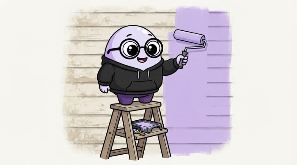
Repainting the old family house
You can't knock the old house down; people live there. So you check which walls are cracked, which rooms are dark, and fix those first, keeping what works. A website redesign is a renovation, not a fresh plot.
Watch it happen
The redesign plan
1/5Audit the current site with Nielsen's heuristics. Screenshot every issue with a short note.
The big ideas
What you need to know
Pick a real site
A local business, your college site or a small NGO works well. Avoid giant brands with huge teams.
Evidence before pixels
Show the audit and test findings first. The redesign only makes sense after them.
Respect constraints
Keep the real brand, content and tech limits in mind. A total rebrand isn't a redesign.
Add a disclaimer
Say clearly it's an unsolicited concept, not work for the company.
See it in code
Walk through the code
1Issue #42Page: Admissions > Fee structure3Heuristic: Recognition rather than recall4What happens: fee PDF link is hidden in a paragraph5Seen in tests: 4 of 5 users couldn't find it in 60s6Severity: 3 (major)7Fix idea: a clear "Fee structure" card on the page1/3Where the issue is and which heuristic it breaks.
One entry in an audit log. A log like this makes prioritising easy and gives your case study hard evidence.
Save yourself the pain
Common mistakes
Oops
Redesigning only because the site 'looks old'.
Do this instead
Base changes on real usability problems you found in the audit and tests.
Oops
Mocking up a giant brand's site and implying it's official.
Do this instead
Pick a smaller real site and label it clearly as a personal concept.
Your mission
Milestone 1: the audit
Quick check
Why test the old website with users before redesigning it?
Go deeper
- 1Choose a website you genuinely find frustrating to use.
- 2Diagnose specific usability issues using Phase 7's heuristic evaluation before redesigning.
- 3Present a clear before/after comparison with reasoning for each major change.
More projects at this stop
 End-to-End App Design Case Study
 Design System Case Study
 Mobile App Case Study
 0-to-1 Product Design Case Study
 Accessibility Audit & Redesign
 Portfolio Website

Stuck on this topic? Ask an Insider
Get 1:1 guidance from people who've walked this exact path — on the InsideEdge app.
