
In short
A loader that spins, a notification that pulses, a hero that fades in. CSS animations play on their own and loop, no JavaScript needed.
`@keyframes` plus the `animation` property let you define multi-step CSS animations that run automatically, loop, or respond to state changes. Good animation communicates state and hierarchy without distracting the user, and developers should also respect reduced-motion preferences for accessibility.
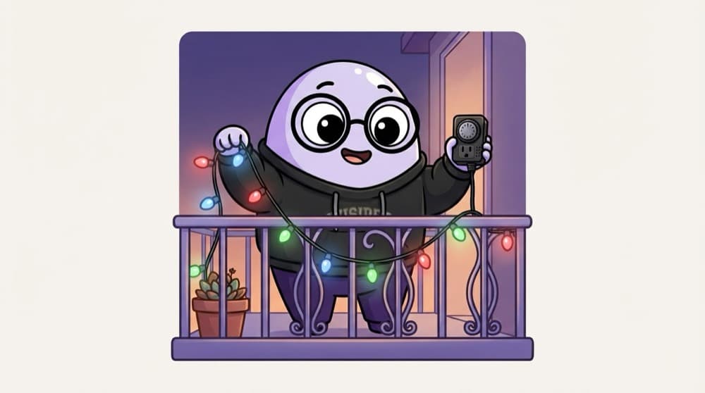
Think of it like this
Diwali lights on a timer
Those blinking serial lights follow a pattern: red, then green, then blue, on repeat. You set the pattern once and they run all night. @keyframes is the pattern, and the animation property is the timer that plays it.
Watch it happen
fade-up over 0.6 seconds
1/5Thanks to both, the heading already uses the from styles, so it doesn't flash before starting.
The big ideas
What you need to know
@keyframes define the steps
You describe what the element looks like at from/to, or at percentages like 0%, 50% and 100%.
animation runs them
animation: name duration timing-function iteration-count. For example: spin 1s linear infinite.
Animate cheap properties
transform and opacity animate smoothly. Animating width, top or margin makes the browser redo layout every frame.
Respect reduced motion
Some people get dizzy from motion. Turn big animations off under prefers-reduced-motion: reduce.
See it in code
Walk through the code
1@keyframes spin {2 to { transform: rotate(360deg); }3}4 5@keyframes fade-up {6 from { opacity: 0; transform: translateY(20px); }7 to { opacity: 1; transform: translateY(0); }8}9 10.loader { animation: spin 0.8s linear infinite; }11.hero h1 { animation: fade-up 0.6s ease-out both; }12 13@media (prefers-reduced-motion: reduce) {14 .hero h1 { animation: none; }15}1/4A one-step keyframe: spin to a full 360 degree turn.
both keeps the 'from' style before the animation starts and the 'to' style after it ends, so there's no flicker.
Save yourself the pain
Common mistakes
Oops
Animating left and top to move things around.
Do this instead
Animate transform: translate() instead. It's smoother because the browser skips layout work.
Oops
Making everything bounce and spin on load.
Do this instead
Use motion to guide attention. One or two subtle animations beat ten loud ones.
Your mission
Build a loader set
Quick check
Which animation is likely to be the smoothest?
Go deeper
- 1Build a simple loading spinner using `@keyframes` and `animation`. Keep the first version small, then add one improvement after the core behavior works.
- 2Practice `animation-timing-function` and `animation-iteration-count`. Test it with at least one normal case and one edge case so you can explain the behavior confidently.
- 3Learn to animate `transform`/`opacity` for smooth, GPU-accelerated motion.
More topics at this stop
 Selectors
 Box Model
 Flexbox
 Grid
 Position
 Display
 Units
 Media Queries
 Transitions
 Transform
 Variables
 Responsive Design
 Pseudo classes
 Pseudo elements
 CSS Architecture
 BEM

Stuck on this topic? Ask an Insider
Get 1:1 guidance from people who've walked this exact path — on the InsideEdge app.
