In short
Move, rotate, scale or tilt an element without disturbing anything around it. Transform powers hover zooms, flip cards and most smooth motion you see.
`transform` lets you rotate, scale, skew and translate elements without affecting document flow — the basis of most modern hover/click micro-interactions. Because transforms generally operate without changing surrounding layout, they are useful for interaction feedback and visual movement with relatively low layout overhead.
Think of it like this
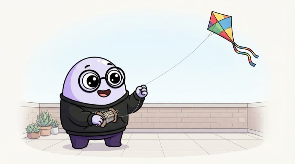
Flying a kite
Your kite can move, spin and look bigger or smaller as it climbs, but the spot where you're standing on the terrace doesn't change. Transform is the kite: it changes how an element looks while its original space in the layout stays exactly the same.
Watch it happen
Why transform doesn't push neighbours
1/4Layout gives each card its box and position in the row.
The big ideas
What you need to know
translate moves
translate(20px, -10px) shifts an element right and up. Percentages are based on the element's own size.
scale resizes
scale(1.05) makes it 5% bigger. Perfect for a gentle hover zoom on cards.
rotate spins
rotate(45deg) turns it. transform-origin decides the pivot point, centre by default.
Order matters
rotate then translate gives a different result from translate then rotate. Functions apply one after another.
See it in code
Walk through the code
1.card img { transition: transform 300ms ease; }2.card:hover img { transform: scale(1.08); }3 4.card { overflow: hidden; } /* keep the zoom inside the card */5 6/* Perfect centring of a popup */7.modal {8 position: fixed;9 top: 50%;10 left: 50%;11 transform: translate(-50%, -50%);12}13 14.arrow.open { transform: rotate(180deg); }1/4The image scales up 8% on hover, smoothly over 300ms.
translate(-50%, -50%) pulls the modal back by half its own width and height, so its centre lands on the screen's centre.
Save yourself the pain
Common mistakes
Oops
Expecting neighbours to move when you scale a card up.
Do this instead
Transform doesn't affect layout. Neighbours stay put, so add gap if the zoom overlaps.
Oops
Writing two transform rules and losing the first.
Do this instead
Transform is one property. Combine functions in one line: transform: translateY(-4px) scale(1.02).
Your mission
Make a flip card
Quick check
You set transform: scale(1.5) on a card in a row. What happens to the cards next to it?
Go deeper
- 1Build a card that scales up slightly on hover using `transform: scale()`. Keep the first version small, then add one improvement after the core behavior works.
- 2Practice combining `translate`, `rotate` and `scale` in one transform. Test it with at least one normal case and one edge case so you can explain the behavior confidently.
- 3Learn `transform-origin` and how it changes rotation/scale behavior.
More topics at this stop
 Selectors
 Box Model
 Flexbox
 Grid
 Position
 Display
 Units
 Media Queries
 Animations
 Transitions
 Variables
 Responsive Design
 Pseudo classes
 Pseudo elements
 CSS Architecture
 BEM

Stuck on this topic? Ask an Insider
Get 1:1 guidance from people who've walked this exact path — on the InsideEdge app.
