
Accessibility Testing (WCAG Basics)
Part of the QA Testing Roadmap
In short
Millions of people use apps with screen readers, keyboard only, or with low vision. If your app ignores them, it's broken for real users, and in many places that's also against the law.
Verifying an application works for people with disabilities — color contrast, keyboard navigation, and screen reader compatibility are the foundational checks, based on the WCAG standard.
Think of it like this
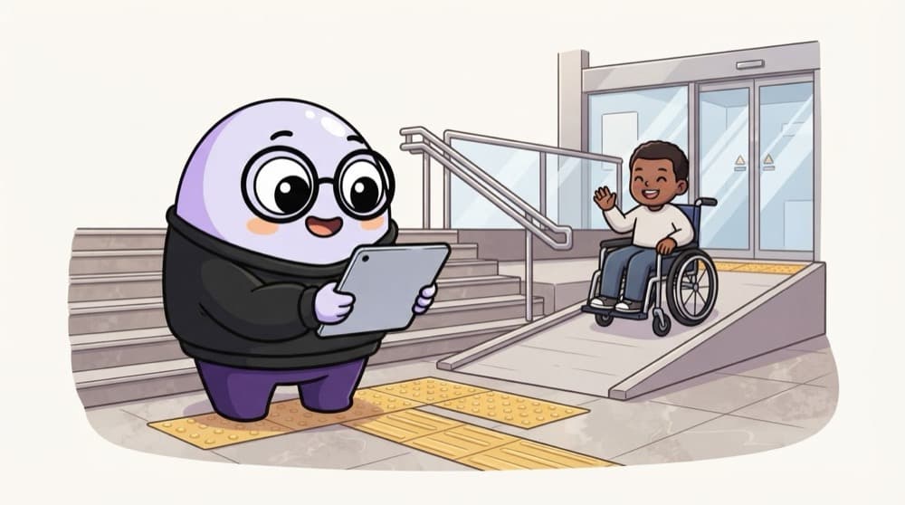
Ramps at the railway station
A station with only steps works fine for most people and completely fails a wheelchair user or someone with heavy luggage. Ramps, tactile tiles and announcements fix that. WCAG is the checklist that makes apps work like a well-designed station.
Watch it happen
WCAG's four principles: POUR
1/5WCAG, the Web Content Accessibility Guidelines, groups every rule under four principles.
The big ideas
What you need to know
Levels A, AA, AAA
Each rule has a level. Most companies and laws target level AA, which includes all A rules too.
Unplug the mouse
Use Tab, Shift+Tab, Enter and Space only. If you can't finish signup, keyboard users can't either.
Try a screen reader
NVDA on Windows is free, VoiceOver is built into Mac and iPhone, TalkBack into Android.
Check contrast
Light grey text on white looks stylish and is unreadable for many people. Measure it with a contrast checker.
See it in code
Walk through the code
1<!-- Fails: no label, no alt text, a div pretending to be a button -->2<input type="email" placeholder="Email">3<img src="offer.png">4<div onclick="pay()">Pay</div>5 6<!-- Passes -->7<label for="email">Email</label>8<input id="email" type="email">9<img src="offer.png" alt="Flat 20% off on your first order">10<button type="button" onclick="pay()">Pay</button>1/3A placeholder disappears when you type. A real label stays, and screen readers announce it.
You don't need to write HTML to test, but reading it in DevTools helps you explain the bug to developers.
Save yourself the pain
Common mistakes
Oops
Treating accessibility as a nice extra to test after launch.
Do this instead
Add keyboard, contrast and label checks to your normal test cases from the first sprint.
Oops
Assuming a passing automated scan means the page is accessible.
Do this instead
Scans catch some issues. Keyboard and screen reader checks by a human are still needed.
Your mission
The no-mouse test
Quick check
A form field has placeholder text 'Phone number' but no label. Why is that a problem?
Go deeper
- 1Test a real app's keyboard navigation, tabbing through every interactive element.
- 2Check a design's color contrast ratios against WCAG AA standards using a free tool.
- 3Learn why accessibility is often a legal requirement, not just a nice-to-have.
More topics at this stop
 Security Testing Basics
 OWASP Top 10 for Testers
 Automated Accessibility Testing Tools
 Penetration Testing Overview for QA
 Vulnerability Scanning Basics
 Compliance Testing Overview

Stuck on this topic? Ask an Insider
Get 1:1 guidance from people who've walked this exact path — on the InsideEdge app.
